
HBCTRI brand v1.0 — July 2026
Race-day
editorial
The HBC Tri identity system: how the club looks, speaks and moves — on the website, on race kit, and in every future campaign. Fast where it counts, warm where it matters.
Logo
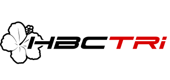
Primary — on paper / light

Reversed — on ink / photography
Palette
Ink and paper do the talking; racing red does the shouting. Teal and gold are functional colours — they signal water data and podiums, never decoration.
Ink
Primary text, blocks, the wordmark
Paper
Backgrounds — warm, never pure white
Racing Red
The action colour. CTAs, accents, 'TRI'
Bright Red
Red on dark backgrounds only
Ocean Teal
Live data & swim conditions only
Podium Gold
Achievements & results only
Type system
Display — Archivo Expanded Black Italic · uppercase
Swim. Ride. Run.
Headlines lean forward like the wordmark — always italic, always uppercase, expanded width, tight leading. This is the voice shouting from the beach.
Body — Archivo · regular width
Body copy is friendly and unfussy. Sentence case, generous line height, written like a clubmate explaining where to park — never like a federation press release.
Data — Martian Mono · race-timing numerals
08:00:00 / 2.8km / 18.4°C
Times, dates, distances, temperatures and prices are always set in the mono — like a finish-line clock. Tabular numerals, uppercase labels, wide tracking.
The kit of parts
The slash
Everything active skews −12°, matching the wordmark's italic. Buttons, tags and dividers lean forward. The triple slash /// is our bullet, our pause, our pace line.
Hard shadows
Cards and buttons cast flat, hard offset shadows — print-like, never blurred. On hover the shadow turns racing red. Nothing floats; everything is pinned to the page.
The hibiscus watermark
The flower appears oversized and cropped at 5–8% opacity on dark sections — a coastal signature, never a decoration sticker.
Race-bib numbering
Sections are numbered like race bibs — 01, 02, 03 — in slashed frames. It paces the page like a race course, and gives every layout a start line.
How we sound
We say
- “Toes in the water at 8am.”
- “Everyone started somewhere.”
- “There's always someone to ride with.”
- “Coffee after. Always.”
We don't say
- “Unlock your potential.”
- “Elite performance solutions.”
- “No excuses.”
- Anything with a lightning-bolt emoji.